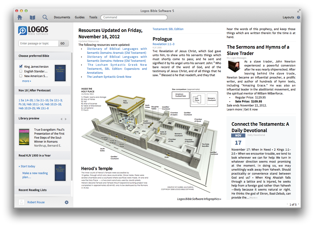
The growth of Logos Bible Software in recent years has transformed their downtown community of Bellingham, Washington. With the release of Logos 5 they have transformed the nature of Bible study technology. I decided to do a thorough review of the new version because it partly fulfills the vision I have described on this blog for the past few years. Logos is doing for the Bible what Google’s Knowledge Graph does for the web: it connects words to what they represent so you can discover relevant facts more quickly.
The best approach to studying the Bible is to put everything in its proper context. We get to know the people in a story by understanding their relationships. We learn to appreciate cultural references by knowing what else was going on the world at the time and in what geopolitical arena it occurred. The new features in Logos are designed to help ministry leaders gather this kind of context.
Sean Boisen, Director of Content Innovation, gives a good overview:
The Most Comprehensive Search Available
The most significant thing about Bible Facts, Clause Search, and the various guides is the database behind it all. Their team has digitally linked countless words with the person, place, or thing they describe. To understand this from a user perspective, compare results when searching for Jesus. In popular online search tools and competing software platforms I found 942 verses. Using Clause Search I found 6,773 references to him.
The difference is that Logos knows which verses talk about Jesus but don’t use one of his names. A prime example is John 3:16: Logos finds it in a search for “Jesus” while others come up empty. The same applies to physical locations or objects that are the subject of a phrase but may not be named directly. To appreciate this more fully, there are at least 70,000 personal pronouns (by my rough count) to digitally tag to make this work. Logos went beyond that into aliases, other nouns and even the implied subjects of verbs. In case you missed it in the video above, that is why it took a team of people three years to complete. I applaud them for that kind of dedication and concern for fine details.
Bible Facts: People, Places, and Things
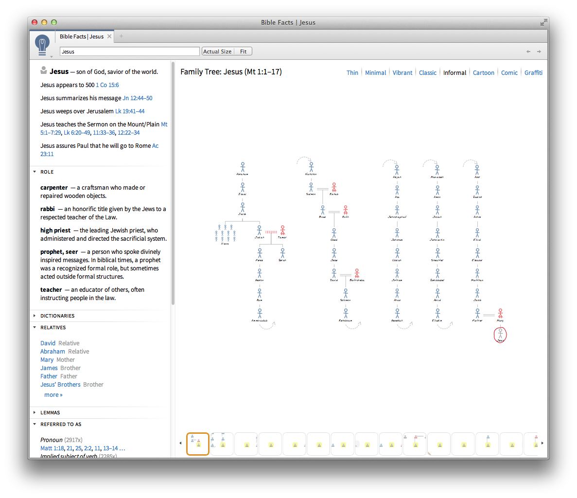
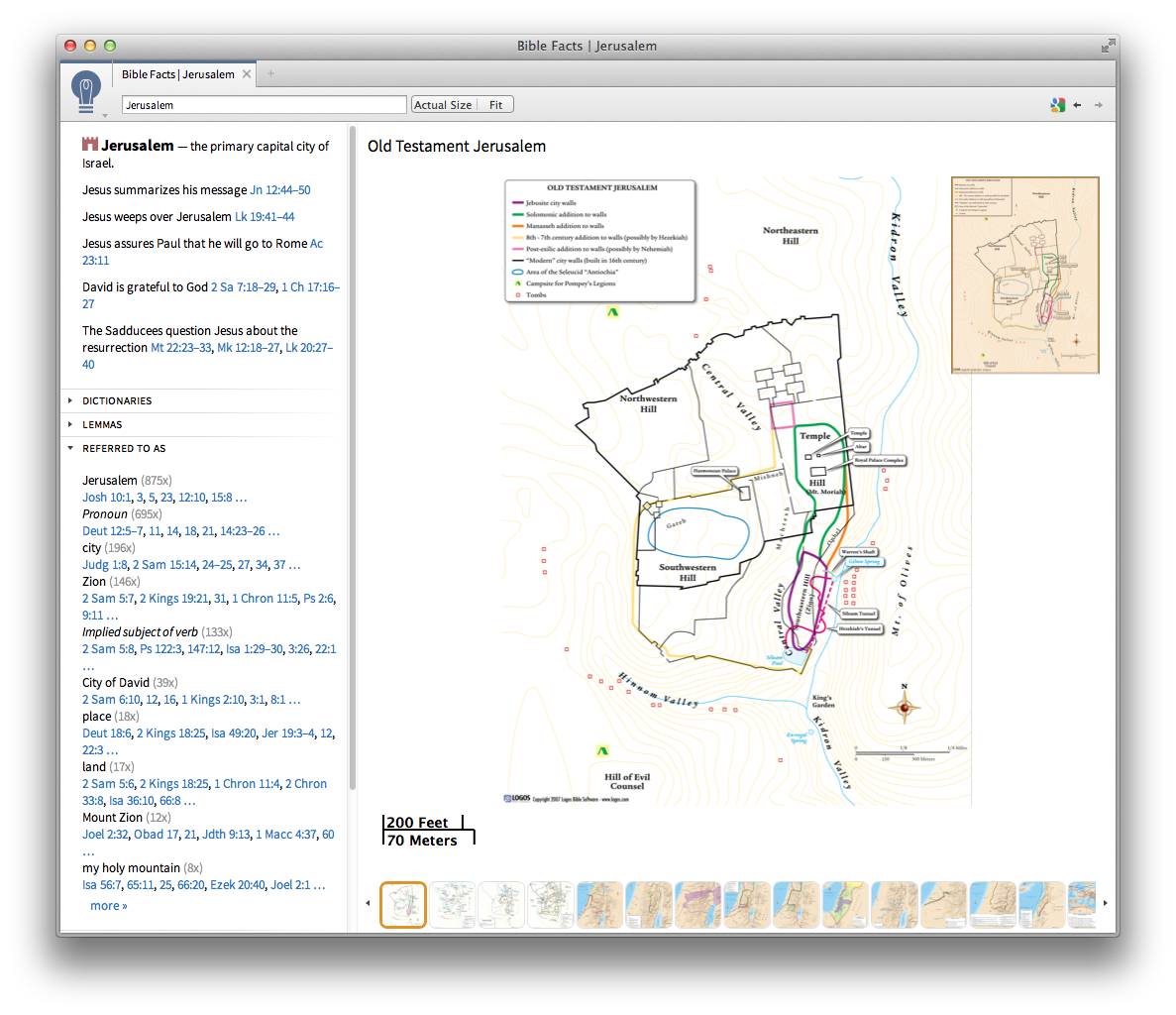
Certain features are common to everything in Bible Facts. You get a short description, verse list, links to the books and media in your library, and original language information. Searching for a person returns their relationships (visually and in list form), roles (king, priest, etc), known aliases, and key life events. Search for a place to get an array of maps and that location’s lat/long linking to a Google view.
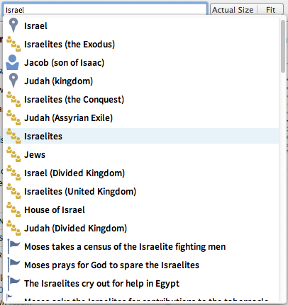
Auto-completion suggestions help you find the right information when a search term could describe multiple things. For example, typing in “Israel” will suggest either the person named Israel (a.k.a. Jacob), the geographic area or the people group known by that name. It also gives some results from events containing that keyword.
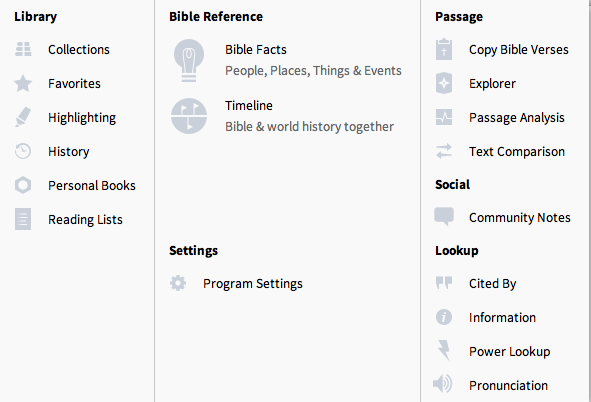
These features work well and are easy to navigate. They go a long way in helping to connect facts together in ways that give you a fuller understanding of each story. The people, places and things you can learn about in the Bible Facts tool are all easily accessible with the Explorer pane. I highly recommend keeping that open all the time.
My only disappointment is that the media provided give small windows of information, not a big picture. One graphic has Jesus’ genealogy from Luke (the line through Joseph). A separate image has the one from Matthew (the line through Mary). There is no graphic showing his complete lineage in one view. Maps have the same challenge. Each shows select places of interest but none show every place mentioned in the Bible in the zoom-able type of interface I love about online maps (known as a “slippy” map). These aren’t easy problems to solve but if anyone can pull it off, Logos would be the company to do it.
Timeline
By contrast, the new timeline offers all biblical events and world history in a single dynamic view. Choose to see as few or as many years as you’d like. Filter out events not mentioned in scripture and filter further by keyword. Then, click on an event to get all the details your digital library has to offer. Clicking the “more” button brings you to an outline view of major periods. That’s the kind of stuff I was expecting to see in maps and family trees. It’s a great user experience in those respects, but it lacks smooth linkage between events and the associated text.
It takes several clicks to get from a selected time period back to the passage of the Bible which deals with it. Going the opposite direction, when reading the Bible I can find no easy way to discover where a passage falls on the timeline without some creative searching involved. If the goal is to gain historical context of a biblical story, why is the timeline so far removed from the source text? I can get there in one click from other resources which mention a year, so why not make it equally well-connected with chapter and verse? This is an obvious shortfall that needs to be addressed in the next update.
Note: the Timeline feature is not offered in the Starter package but is there in all others.
Passage Analysis
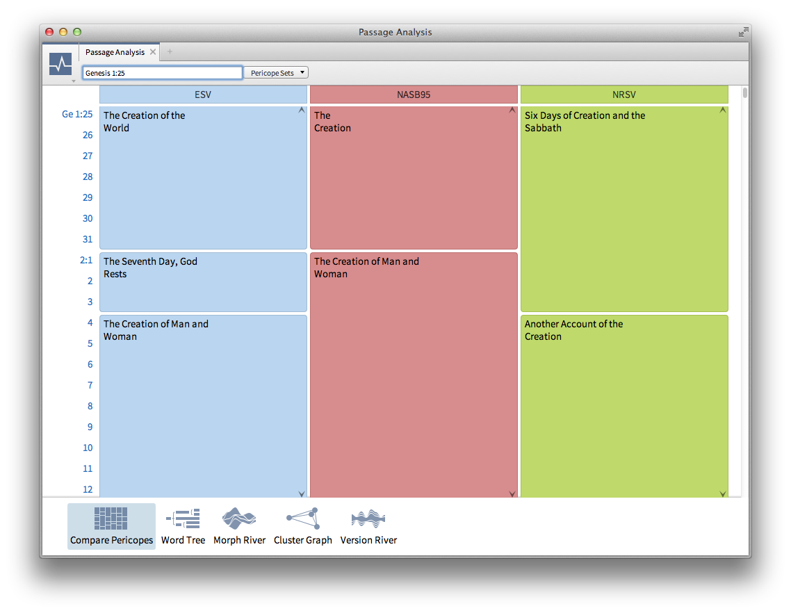
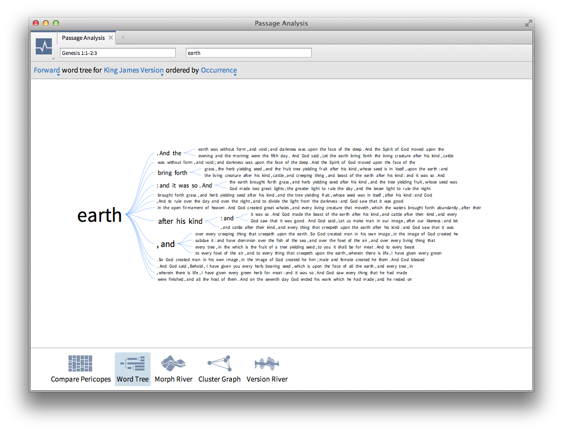
Given my propensity for data visualization, I wanted to specifically deal with a feature which is not new in this version but is focused on graphical analysis. I give it 2 out of 5 stars. The pericope comparison is easy to follow and clearly shows how different Bible versions split up and name sections. That’s the first star. Word trees are a concise, easy way to show repetitions and discover literary structures. Another star performer.
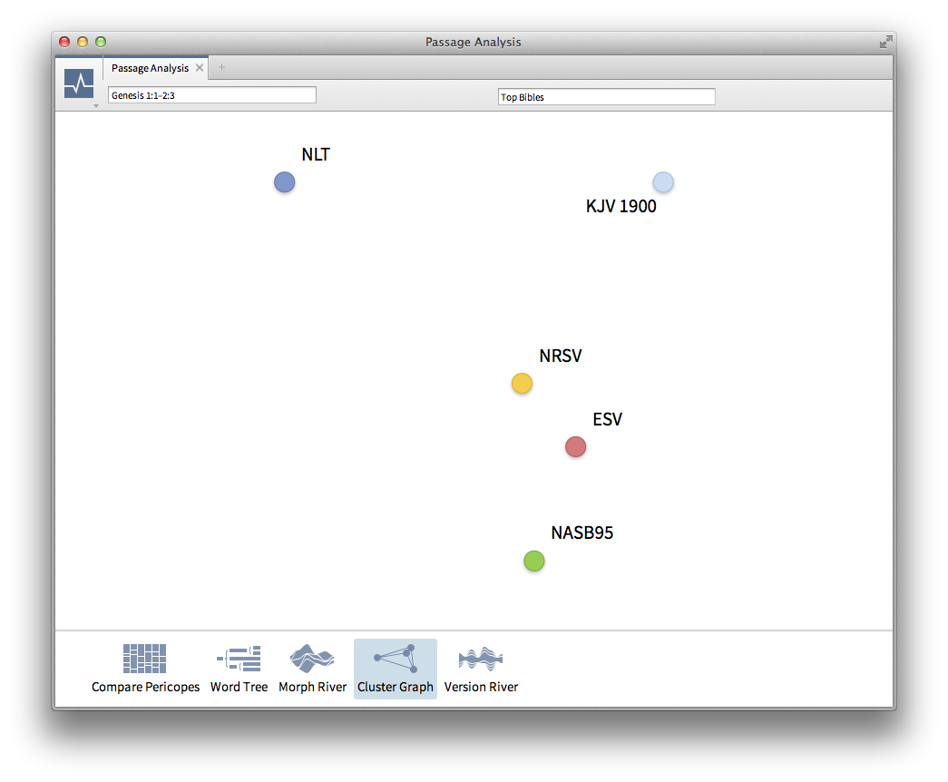
The remaining three visualizations get zero stars because they break a cardinal rule: label your axes. The Cluster Graph appears to be an x,y scatter plot but has no text telling what either axis represents. What is it comparing? Why is one translation on the top-right while the others are scattered to the left, right, bottom, and every place in between?
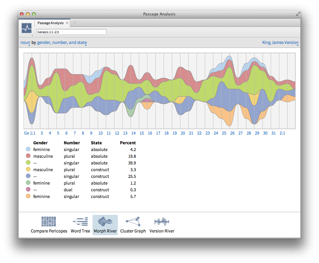
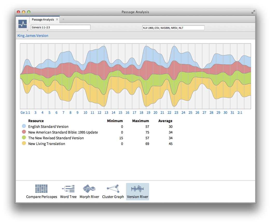
The Morph River and Version River do slightly better by including verse numbers on the horizontal axis labels, but still nothing on the vertical axis. I assume it has something to do with how many words are different between the base text and the one(s) it compares. It may be a raw number or it could be a percentage – I just don’t know. Both use a chart type which is ill-advised by data visualization experts because the eye has a hard time comparing values with fluid reference points.
Readers may find my criticism a little too picky. Average users may not have much need for any of these graphs and won’t think it’s any big deal. Take these comments with the understanding that data visualization is my main area of interest these days. It’s what I focus on the most because it’s something I love. This company has a reputation for exceptional quality which makes me believe they can do better information design than what I described.
Who It’s For and What It Costs
Logos products have a higher price tag than anything else you’ll find on the shelf at the local Christian bookstore. The biggest reason is it has almost as many resources as a small bookstore would. Prices range from $294 for a Starter package all the way up to $4,979 for the top-level Portfolio package. You can get anywhere from 207 to 2,563 high-quality resources. Most people not involved in full-time ministry or seminary would consider both the price and volume of content a bit too much to handle.
Is it worth the cost to those who can afford it and would have a use for everything from original language lexicons to sermon helps? Yes, it is. Publisher’s Weekly reports the average price of non-fiction e-books is $6.47. I reviewed Logos 5 Silver which is listed at $999.95 including 699 resources. That’s $1.43 each (read: huge bargain). On top of that, the books and media are smart-tagged, linked to features not found on any e-reader, and they’re synchronized across platforms and devices. Pile on a 15% introductory discount and things begin to look even more attractive. For the “smart shoppers,” Logos sometimes offers deeper discounts at large conferences or training events. Be sure to ask about that the next time you attend one of those.
Note: existing Logos users should see this post from CEO Bob Pritchett to better understand upgrade options and costs.
What to Expect in the Future
I don’t have inside knowledge of Logos. For that, I point you to Sean Boisen’s blog which promises to offer that in the current series of posts. From the changes I’ve seen in the past two versions of their flagship product, the trend is toward linking the content you’re studying to the context you need at all levels of detail – right down to the jot and tittle. Their challenge for the future is finding better ways for us to explore the richest data on the market. I can’t wait to see what they come up with next.
.png)

3 replies on “Logos 5 Review: Connecting Content With Context”
I know that this is a really old post, but I thought I’d shed a bit of light on the “unlabeled axes” in Passage Analysis. (I worked on the original version of the features ca. 2002)
In the Cluster Graph, the axes (and even the position of the points) don’t actually mean anything. The meaningful portion of the visualization is the *distance* between points. Versions rendered close together are “similar”, while versions far away are “different”. (The visualization is a 2D projection of a much higher-dimensional figure based on word choice)
The Version River is essentially a different view of the same data. There isn’t a definite quantity being measured or displayed: wider bands indicate a greater degree of “difference” from the chosen base translation, and the only useful points of reference are the other bands.
Thanks for that insight. In order to produce a graph of any kind there has to be some kind of quantity displayed. Is this quantity just a subjective representation, or is there some kind of calculation behind it? I really do think that any sort of text, caption, whatever to let a user know what is being shown, even just “distance between points indicates degree of difference” would go a very long way in making these visualizations more meaningful.
We start with an N-dimensional space where N is the number of unique words across all translations being compared. (we may use a stemming algorithm to reduce this number, but I’m not certain of this)
Each translation is assigned a position in this space based on the number of times each word occurs in the translation—each occurrence places the translation one unit farther away from the origin along that words axis. We then normalize all points so that they are one unit away from the origin. (that is: if one translation contained the text of the ESV, and another “translation” contained the text of the ESV repeated twice, both would occupy the same position after normalization)
After assigning these positions, we project them into the hyperplane occupied by the two points that are farthest away. This process is repeated until the points have been projected into a 2D space.