Categories
Alleged Errors The Bible Visualizations

Skeptics Are All Out of Ideas

Criticism of God’s word is nothing new.  It was there in the beginning (Gen 3:1) and it lives on today. The ideas are always the same, just repackaged and recopied from someone else. Sometimes the tactic is simple mockery – taking a beautiful work created by someone else and flipping it onto its unbiblical head. It requires some dedication but little imagination.  Case-in-point: the most popular visualization of “contradictions” from Project Reason is not much more than a re-hash of Chris Harrison’s original award-winning visualization of cross references

Categories
Analysis Application Cool Tools Genealogy MetaV The Bible The First Days Visualizations

Jesus’ Genealogy and the Tribes of Israel [Interactive]

When I created Mapping God’s Bloodline, I had no idea what a turning point it would be for this website.  Until then, few had visited the site.  Once a few influential people shared it on social media, I discovered how visualization could turn a boring, tedious subject into something people find highly engaging. 

Categories
Visualizations

Information Design in the Marketplace of Ideas

Harmony of the Gospels
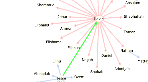
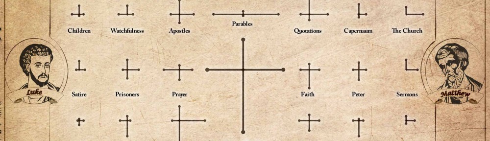
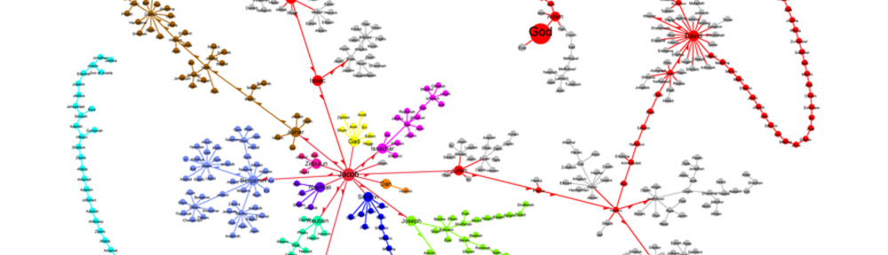
Today, the shortlist for the Information is Beautiful Awards was announced – and one of my graphics made the list! This is the first-ever open contest to find the best information visualizations around the world. I am quite honored to be among the top 25 finalists in the data visualization category with my entry  “A Visual Harmony of the Gospels” (further explanation here). This and “Mapping God’s Bloodline” made the long list.  I was surprised to see the less popular one advance to the next round. Winners in each category will be announced at the end of September. One special category is the Community Award which will be open for voting until September 24th (click here to vote). So, this post is to explain more of my perspective on these awards and why you should vote for my entry (and tell your friends, too!).

Data visualization, broadly defined, is an attempt to make complex sets of facts more understandable though the use of visual design elements. As the amount of data we create each year continues to rise, so does the popularity of its illustrations. The likely places to find such graphics are in scientific studies, journalism, political propaganda, and special interest blogs. However, it is unlikely to find much in religious pursuits. For this reason, few of the websites which curate the best visualizations have a “Religion” category (my work always ends up in the “Lifestyle” section).

I’m attempting to change that.

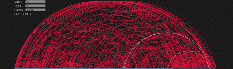
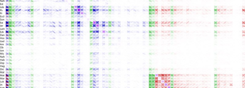
The Bible is more than just a story book or a manual for morality. It is a record of history that spans thousands of years, mentioning over 3,000 people and 1,200 places using 790,685 words to document the details. Scholars have catalogued 400,000 cross-references and grouped passages into 125,000 topics. How are all these things connected? Which ones are mentioned most often (or least often)? What can this tell me about God’s design of history? Data visualization offers another way to answer these questions by piecing together the massive volume of information and condensing it to visually comprehensible designs.

These awards offer an opportunity to display a different approach that uses modern techniques to portray timeless truths. It is another chance to bring Christianity to the worldwide marketplace of ideas. While I’m confident that God’s truth will ultimately prevail, I know I am an imperfect ambassador of the knowledge he has given us. That, and we live in a sinful world where truth is not clearly seen. So, I need God’s help and I need your help. Please pray for my ongoing efforts and particularly for this award. Share this post with others and ask them to take a moment to vote for “A Visual Harmony of the Gospels.”

Finally, in the interest of full disclosure, there is a monetary component to the award. The Community Award winner will get $1,000. Other award categories range from $250 to $5,000. If I do win in one or more categories, the proceeds will likely go toward furthering my efforts in this area.

Categories
Analysis Application MetaV The Bible Visualizations

A Visual Harmony of the Gospels

Harmony of the Gospels
Order prints here.   Click the image to download a high resolution version.

The Gospels tell the story of Jesus Christ, each one emphasizing different aspects of his time and teachings. A typical harmony of the Gospels lays out all the events and references the passages that describe them in each book. This chart takes a different approach by comparing the broader topics illuminated by those verses.

The sides of each cross are scaled according to how often a topic is dealt with in the corresponding book (as a percentage of the total number of verses in that book). The right side represents Matthew, the top is Luke, left for Mark, and the bottom line goes with John. The topics and verse references are from the topical index in MetaV which has a mashup of Nave’s Topical Bible Concordance and Torrey’s New Topical Textbook.

A Valid Approach?

It is common to hear a pastor tell how often a certain word appears in the Bible or in a particular book to support his point. But, is this an accurate representation? One can discuss the topic of faith, for instance, without ever mentioning the word directly. I could envision many ways in which the word-count approach would leave a false impression.

It may be more accurate to look at topics and to compare them against each other to see their relative prominence. But, even this approach can have its distortions. It relies on indexes produced by people in a particular culture and historical period. That could introduce some bias in assigning topics to each verse, thereby skewing the whole thing – consciously or not. Overall, however, the comparisons here line up well with what you would conclude after reading it all for yourself (by far the best approach).

About that one in the middle…

It should be no surprise that the lines representing Jesus Christ would be the longest. If it had turned out any other way, I would have begun looking for errors in my data. What is surprising, however, is that the lines form a nicely proportioned cross. According to the topical indexes I chose, John focuses more on Jesus, Mark slightly less, and the others hit close to the average. I’ll leave it to the reader to decide if this is a convenient coincidence or a divine design.

Due to space and readability limitations, only the highest-ranking topics (based on total verse count) made the list. Are you surprised to see any of them in the top 48? Which ones would you expect to be more prominent that aren’t shown on this chart? What stands out in terms of what different writers emphasize? Please leave your comments below – I’d love to hear some insights.

Order prints here.

Categories
Analysis Cool Tools The Bible Visualizations

Visualizing Cross References (Again)

When R.A. Torrey compiled his Treasury of Scripture Knowledge, I doubt he could have envisioned the ways in which those hundreds of thousands of cross references would take shape years later.  Inspired by Chris Harrison’s rainbow-arc visualization which used a smaller set of cross references, OpenBible.info applied the shape to Torrey’s massive database.  Using a combination of these data sources, I added my own summary level analysis of reference frequency in each chapter of the Bible.

Now, OpenBible.info has gone one step further, this time apparently inspired by a cross-reference layout illustrated at the crossway blog back in 2006.  This new interactive visualization is a grid layout with books (or groups of books) along the top and left-hand side.  Each grid cell represents the cross references between those books.

cross reference grid
Grid of Cross References from OpenBible.info

What makes this visualization much more interesting than previous graphics is the way each grid cell is colored.  Red is a link from a New Testament book, blue for the Old Testament, green for major divisions of the Bible, gray indicates a cross-reference from a verse in one chapter to another verse in the same chapter, and purple indicates references between chapters in the same book.

As soon as you start getting “interactive” with it, you discover how the color intensity is produced, forming the heat map effect in the grid above.  For instance, if you choose to show references from John to Isaiah, you see details of how the passages in those books connect to one another.  More lines between them result in more color displayed in the larger grid.

Cross Reference between John and Isaiah
Cross References between John and Isaiah

Such an interactive visualization makes it far simpler to navigate and understand Torrey’s massive dataset.  Even if you are not especially interested in exploring these details, everyone should be able to appreciate the message that this and earlier cross-reference visualizations share in common: that the words given to us by God are deeply woven together throughout all the times and cultures in which they were transcribed.

Categories
Analysis Cool Tools Genealogy MetaV The Bible The First Days Visualizations

Mapping God’s Bloodline

Follow the genealogy of Jesus from the creation of Adam and Eve through Noah, the tribes of Israel, King David, and finally Joseph and Mary. Zoom out for a broader perspective or zoom in to examine finer details.

Categories
Cool Tools MetaV The Bible Visualizations

Everywhere, All at Once!

We have come a long way from the days when you had to choose between an unwieldy Bible atlas or else limit yourself to a handful of maps in the back of your everyday Bible. With the proliferation of free online mapping tools hosted by Google, Yahoo, MapQuest, and others, we have the ability to overlay practically any information we want onto satellite imagery or simple region outlines. Naturally, some industrious Christians have incorporated some of the information from that old atlas into interactive maps.

One of these is BibleMap.org which does a great job of helping you explore the places mentioned in a particular chapter of the Bible that you may be reading or studying at the time. Another approach is that of OpenBible.info which allows users to download place marks for Google Earth, either for the entire Bible or individual books.  One limitation of each of these is that it is either difficult or impossible to see every place all at once without downloading additional software.

That’s going to change right here, right now.  Thanks to a powerful tool called Tableau Public recently made free for limited use on open-source data, we can download a file from a site like OpenBible.info and make some interesting comparisons.  We can vary the colors and sizes of each place mark, filter for a particular place or book, and much more that can help us discover new insights or rediscover old ones. For example, the New Testament more heavily references northern regions and … wait a second! Since when was Spain referenced in the Bible? And, just where are Gog and Magog, anyway?

Here are a few tips for exploring the information.  Click the legend to show only New or Old Testament references.  Hover over a place mark to see more info, or click on it to see all the references associated with that place.  Click-and-drag to select more than one place.  Use the arrow icon at the bottom to allow for zooming and panning around the map.  Choose one or more books for other filter options.  Click the name of  a place in the data sheet to reveal its location on the map.  Most of all, have fun seeing the Bible in a whole new way! Note: the map may take a while to load.


There are a few things to bear in mind, however. First, the country divisions on this map correlate to present boundaries, not the boundaries as they were in the past. Bodies of water or whole countries are shown as a single place mark, which can make things somewhat difficult to interpret. I did not compile the original data, but as near as I can tell it is limited to explicit references of a place by name; it does not include verses which describe an event which took place in a particular location but doesn’t mention the place by name. Lastly, places mentioned during a time period before Noah’s flood are not shown since the global flood would have reshaped the landscape enough to make its location impossible to accurately identify.