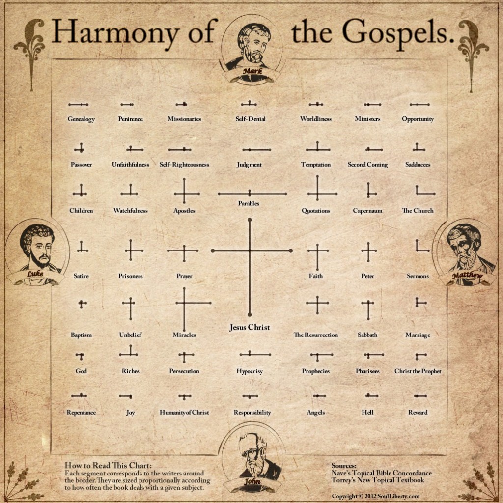
The Gospels tell the story of Jesus Christ, each one emphasizing different aspects of his time and teachings. A typical harmony of the Gospels lays out all the events and references the passages that describe them in each book. This chart takes a different approach by comparing the broader topics illuminated by those verses.
The sides of each cross are scaled according to how often a topic is dealt with in the corresponding book (as a percentage of the total number of verses in that book). The right side represents Matthew, the top is Luke, left for Mark, and the bottom line goes with John. The topics and verse references are from the topical index in MetaV which has a mashup of Nave’s Topical Bible Concordance and Torrey’s New Topical Textbook.
A Valid Approach?
It is common to hear a pastor tell how often a certain word appears in the Bible or in a particular book to support his point. But, is this an accurate representation? One can discuss the topic of faith, for instance, without ever mentioning the word directly. I could envision many ways in which the word-count approach would leave a false impression.
It may be more accurate to look at topics and to compare them against each other to see their relative prominence. But, even this approach can have its distortions. It relies on indexes produced by people in a particular culture and historical period. That could introduce some bias in assigning topics to each verse, thereby skewing the whole thing – consciously or not. Overall, however, the comparisons here line up well with what you would conclude after reading it all for yourself (by far the best approach).
About that one in the middle…
It should be no surprise that the lines representing Jesus Christ would be the longest. If it had turned out any other way, I would have begun looking for errors in my data. What is surprising, however, is that the lines form a nicely proportioned cross. According to the topical indexes I chose, John focuses more on Jesus, Mark slightly less, and the others hit close to the average. I’ll leave it to the reader to decide if this is a convenient coincidence or a divine design.
Due to space and readability limitations, only the highest-ranking topics (based on total verse count) made the list. Are you surprised to see any of them in the top 48? Which ones would you expect to be more prominent that aren’t shown on this chart? What stands out in terms of what different writers emphasize? Please leave your comments below – I’d love to hear some insights.
