When R.A. Torrey compiled his Treasury of Scripture Knowledge, I doubt he could have envisioned the ways in which those hundreds of thousands of cross references would take shape years later. Inspired by Chris Harrison’s rainbow-arc visualization which used a smaller set of cross references, OpenBible.info applied the shape to Torrey’s massive database. Using a combination of these data sources, I added my own summary level analysis of reference frequency in each chapter of the Bible.
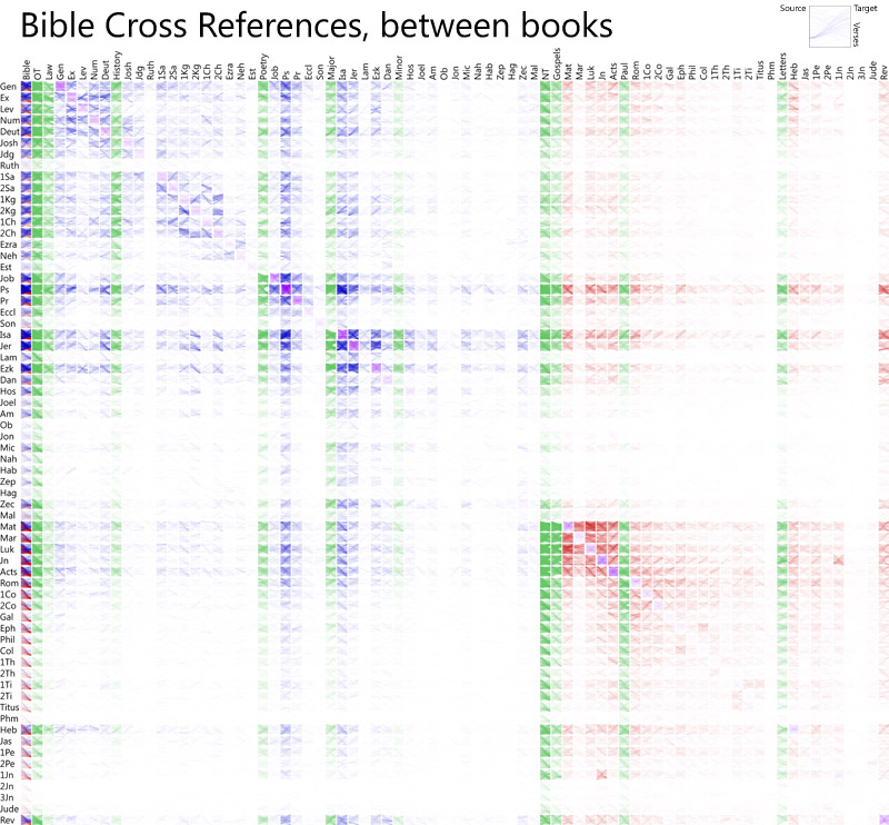
Now, OpenBible.info has gone one step further, this time apparently inspired by a cross-reference layout illustrated at the crossway blog back in 2006. This new interactive visualization is a grid layout with books (or groups of books) along the top and left-hand side. Each grid cell represents the cross references between those books.

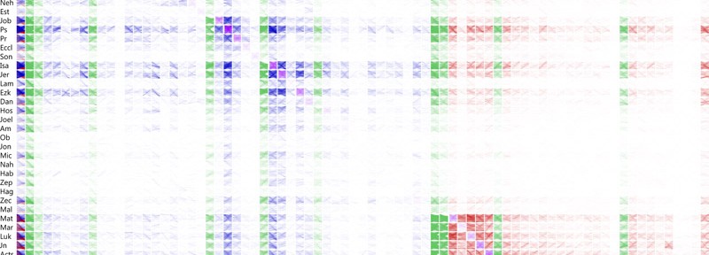
What makes this visualization much more interesting than previous graphics is the way each grid cell is colored. Red is a link from a New Testament book, blue for the Old Testament, green for major divisions of the Bible, gray indicates a cross-reference from a verse in one chapter to another verse in the same chapter, and purple indicates references between chapters in the same book.
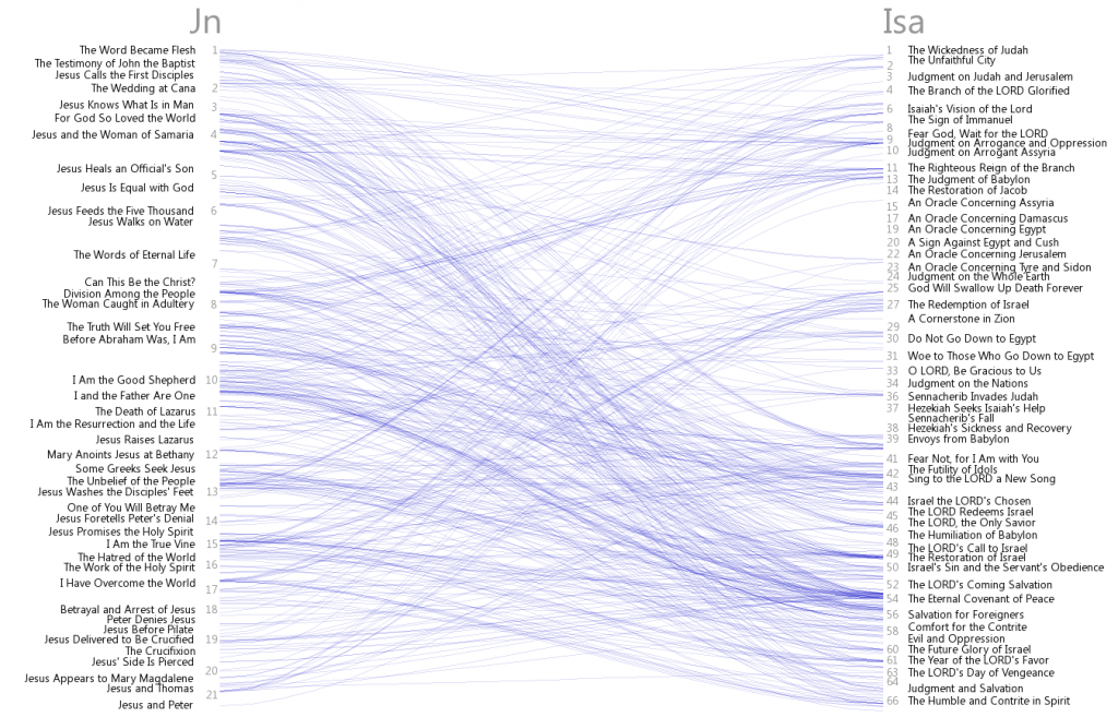
As soon as you start getting “interactive” with it, you discover how the color intensity is produced, forming the heat map effect in the grid above. For instance, if you choose to show references from John to Isaiah, you see details of how the passages in those books connect to one another. More lines between them result in more color displayed in the larger grid.

Such an interactive visualization makes it far simpler to navigate and understand Torrey’s massive dataset. Even if you are not especially interested in exploring these details, everyone should be able to appreciate the message that this and earlier cross-reference visualizations share in common: that the words given to us by God are deeply woven together throughout all the times and cultures in which they were transcribed.

